 Visualization tools propose simple or more complex ways to display various types of data. Using the right library will help you explore your data efficiently.
You can play with most of the libraries described on this page by following this tutorial.
Raster Data
Raster data represents continuous spatial data, such as satellite imagery (see the Data hub page to learn more about satellite data providers), elevation models, or climatic variables. Below are some Python libraries suited for raster visualization.
Simple Raster Visualization
| Function | Tools | Related use cases |
|---|---|---|
| Simple Raster Visualization | Matplotlib | Basic raster image display with customizable color maps. |
| Rasterio | Efficient reading and visualization of raster datasets, particularly georeferenced data. | |
| Earthpy | Dedicated to earth sciences, useful for handling and visualizing multi-band raster data. |
Interactive Raster Maps
Interactive tools can provide dynamic visualization of raster data:
| Function | Tools | Related use cases |
|---|---|---|
| Interactive Raster Maps | Folium | Ideal for overlaying raster images on interactive maps with transparency and other interactive features. |
Advanced Raster Use Cases
For large datasets or analysis-focused visualizations:
| Function | Tools | Related use cases |
|---|---|---|
| Visualization ForAdvancedRaster Use Cases | Cartopy | Allows plotting raster data on maps with geographic projections. |
| HvPlot - Datashader package | Efficiently visualizes raster datasets, maintaining performance. |
Vector Data
Vector data are collections of point coordinates representing specific earth observation features, or defining polygons of interest.
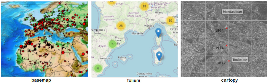
Scattered Points
Different Python libraries can do the trick in this case:
| Function | Tools | Related use cases |
|---|---|---|
| Scattered PointsVisualization | Geopandas | Used for storage, data manipulation and plot. |
| BaseMap | Performs plot job, based on matplotlib, with some colorful background maps. | |
| Folium | Plot interactive maps, like Google Maps, with some practical way to plot large databases (cluster points, heatmap, ...). | |
| Geoplot | Based on matplotlib like BaseMap. | |
| Earthpy | Provides tools for working with spatial data, including data manipulation, visualization, and analysis, specifically designed for earth sciences. |
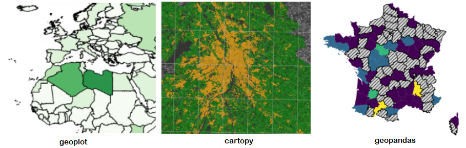
Polygons
Choropleth can be a useful and easy way to visualize how a variable (numerical, string, ...) varies across a geographic area (polygon, multipolygon, ..) by plotting a map composed of colored polygons. Different Python libraries have a direct function for this :
They each have several ways of personalizing these figures.
In addition, Cartopy, Folium and Earthpy can combine choropleth and images data.
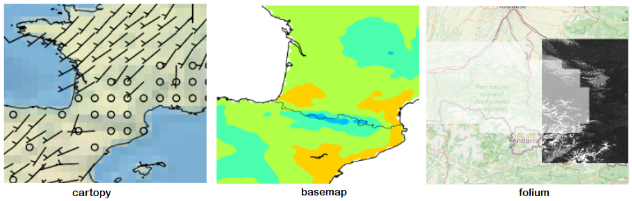
Meteorological data
Depending on the type, several libraries are possible :
| Meteorological data type | Tools |
|---|---|
| Simple variables (like temperature). | BaseMap |
| More complex variables (like wind). | Cartopy |
| Mask array like snow mask (on a S2 image) | Cartopy and Folium |
Statistics
Several python libraries exist for making statistical (and beautiful) graphics in Python. You can use :
| Function | Tools | Related use cases |
|---|---|---|
| Statistics | Seaborn | Builds on matplotlib and integrates (geo)pandas data structures. |
| HvPlot - Datashader package | Allows to visualize and interactively explore very large data. | |
| Plotly, Bokeh |
Due to the number of interesting existing libraries, this part can be a section in its own right !
Graphical User Interfaces
While Python offers a robust ecosystem for geospatial data processing and visualization, other tools can also be highly valuable depending on the use case.
For example, QGis provides a comprehensive open-source solution for geospatial data manipulation and visualization, while GRASS GIS excels in advanced spatial analysis and processing, particularly for raster and vector data. For web-based applications, tools like MapServer and GeoServer enable the publication and sharing of interactive maps.
These solutions complement Python libraries, offering additional flexibility and capabilities for geospatial workflows and data dissemination.